SL Paper 1
Discuss why resource conservation strategies may be more effective than population control in reducing global resource consumption.
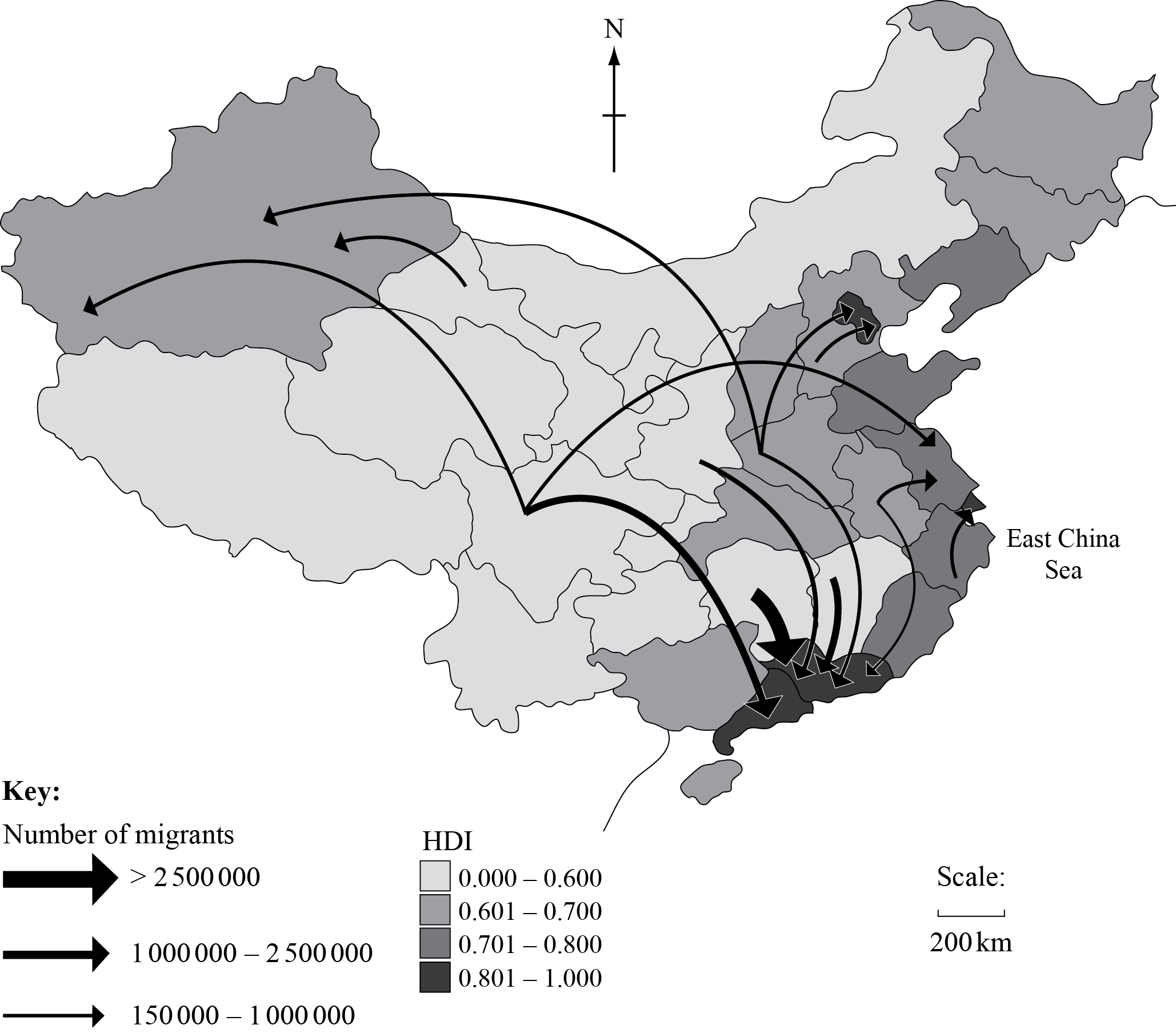
The map shows internal migration flows in China and the Human Development Index (HDI) for each province for 2005.
[Source: Human Development Report (2009)]
Describe the pattern of internal migration shown on the map.
Briefly explain three positive socio-economic impacts that this migration could have for the provinces of destination.
Explain why an imbalance in the birth ratio exists in some societies.
Examine the view that population change is responsible for water scarcity.
The map shows the maternal mortality ratio (maternal deaths per 100 000 live births) for different countries in 2010.

[Source: Reproduced, with the permission of the publisher, from Trends in Maternal Mortality: 1990 to 2010. Geneva, World Health Organization, Fig. 1, p. 23. http://www.unfpa.org/webdav/site/global/shared/documents/publications/2012/Trends_in_maternal_mortality_A4-1.pdf (accessed 08/01/2014)]
Briefly describe the global pattern of the maternal mortality ratio shown on the map.
Suggest two reasons why the maternal mortality ratio is so high in some countries.
Explain the recent trends in life expectancy at birth for a named country or region.
The graph shows the predicted population pyramid for a country in 2025.
[Source: adapted from U.S. Census Bureau, International Data Base]
Describe the predicted population structure of this country in 2025.
Distinguish between a population projection and population momentum.
Explain the economic impacts of an ageing population on a named country.
The graph below shows the relationship between GDP per capita and life expectancy at birth for a number of countries in 2010.

[Reproduced from Wilinson R.G. and Pickett K.E., The Spirit Level: Why more equal societies always do better.]
(a) Describe the relationship shown on the graph.
(b) Suggest two possible reasons for the relationship described in (a).
Explain two economic effects of a youthful population structure.
“Forced international migrations bring more positive than negative impacts to recipient countries”. Referring to examples, discuss this statement.
“Falling fertility rates are no guarantee of reduced resource consumption.” Discuss this statement, referring to examples.
Examine the relationship between environmental change and human migrations.
Examine the view that rapid population growth will prevent some countries from meeting their Millennium Development Goals.
“Investing in gender equality is the most effective strategy to promote economic and social development.” Discuss this statement.
“Migration reduces disparities in wealth and development.” Discuss this statement.
The graph shows how female empowerment in politics has changed in different regions since 1997.
[Source: adapted from UNESCO]
Referring to the graph, describe how female empowerment in politics varied between regions in 1997.
Suggest reasons why female empowerment in politics has risen since 1997.
Analyse the pro-natalist policy of a country you have studied.
Referring to one or more countries, discuss the view that internal (national) migration can help to reduce economic and social disparities.
Using examples, examine how environmental factors can be a cause of migration.
The diagram shows the gender gap index for country X and the world average (representing 115 countries), which shows the level of success in achieving gender equality for women in the four aspects given below.
The index ranges from 0.00 (total inequality) to 1.00 (total equality).

Referring to the diagram, state the rank order (from highest to lowest level of equality) for the four aspects of the world average.
Describe the status of women in country X.
Explain the relationship between fertility and the status of women.
The third Millennium Development Goal is to “promote gender equality and empower women”. To what extent might international migration play a role in helping this goal to be achieved?
To what extent do the most successful poverty reduction strategies focus on wealth creation and gender equality?
Examine the view that gender inequalities are a major obstacle to development.
“Environmental sustainability will never be achieved without population control.” Discuss this statement.
“The fact that the world’s population is now growing less rapidly means that there will be less pressure on the environment.” Discuss this statement.
To what extent do migrations bring benefits to both their origins and their destinations?
“Population growth is the greatest threat to our planet’s soil quality and biodiversity.” Discuss this statement.
“Rapid population growth is the main cause of soil degradation and reduced biodiversity.” Discuss this statement.
“Government attempts to control population growth are ineffective.” Discuss this statement.
“A falling fertility rate is always beneficial to a country.” Discuss this statement.
“Greater gender equality is the most effective way to reduce poverty and stimulate development.” Discuss this statement.
Populations in transition
The graph shows the actual dependency ratios for 2010 and the predicted dependency ratios for 2050 for a selection of countries.

[Source: Graph adapted from Attitudes about ageing: A global perspective, Pew Research Center, Washington, D.C. January 30 2014, http://www.pewglobal.org/2014/01/30/chapter-2-aging-in-the-u-s-and-other-countries-2010-to-2050/. Pew Research Center bears no responsibility for the analyses or interpretations of the data presented here. The opinions expressed herein, including any implications for policy, are those of the author and not of Pew Research Center. Data adapted from United Nations, Department of Economic and Social Affairs, Population Division (2013). World Population Prospects: The 2012 Revision, Volume II, Demographic Profiles (ST/ESA/SER.A/345).]
Outline how a country’s dependency ratio is calculated.
Describe two predicted regional trends shown on the graph.
Suggest one reason for the predicted change in Nigeria’s dependency ratio.
Suggest one positive and two negative socio-economic impacts of an aging population for one named country.
Named country:
Positive impact:
Negative impact 1:
Negative impact 2:
The graph shows how total fertility rates have changed between 1970 and 2013 in different regions of the world.

Outline what total fertility rate measures.
Describe the trends shown on the graph.
Suggest two reasons for the change to the total fertility rate in Asia.
1.
2.
Explain the difference between a population projection and population momentum.
The graph shows the percentage ownership, by gender, of agricultural land for selected countries.

[Source: Food and Agriculture Organization of the United Nations, Gender and Land Rights Database,
http://www.fao.org/gender-landrights-database/data-map/statistics/en/?sta_id=1168. Reproduced with permission.]
State the country with the biggest gap between female and male land ownership.
Suggest two reasons why the percentage of female land ownership in Malawi is similar to the percentage of male land ownership in Malawi.
Reason 1:
Reason 2:
Explain three socio-economic impacts of a youthful population for a country.
Impact 1:
Impact 2:
Impact 3:
The graph shows the old-age dependency ratio in 2010 and the estimated old-age dependency ratio for 2050 for a selection of countries.

Describe what is meant by old-age dependency ratio.
Identify which country on the graph is predicted to have the fastest growth in old-age dependency between 2010 and 2050.
Explain two reasons why the population is ageing in the five countries shown.
Suggest two reasons why men have a lower life expectancy than women in most countries.
The bar graph shows the total number of people in the world who are classified by the United Nations (UN) as forced migrants.

Describe the trends in numbers of internally displaced persons (IDPs) between 1990 and 2010 as shown on the graph.
State the key factor that determines whether a forced migrant is a refugee or an internally displaced person (IDP).
Suggest one political and one environmental cause of the rapid increase in the total number of forced migrants since 2011.
Political:
Environmental:
State two incentives used in a recent pro-natalist national policy.
Country name:
Incentive 1:
Incentive 2:
Explain why these incentives were introduced in the country you named in (d)(i).
1. Populations in transition
The graph shows the population pyramid of an oil-rich Middle Eastern nation in 2012.

Describe the population structure of this country.
Suggest one reason for the structure of the economically active population.
Explain three socio-economic impacts of an anti-natal policy in one named country.

Define Crude Birth Rate.
Estimate the rate of natural increase in 2010.
State the year in which the natural increase rate is projected to become negative.
Explain the meaning of the term population projection.
Suggest two reasons why governments need population projections.
The graph shows the changes in child mortality rates for selected regions of the world since 1990.

State what the child mortality rate measures.
Describe the trend in child mortality shown on the graph for Europe and Central Asia.
Suggest two reasons for the trend in child mortality since 1990 in Sub-Saharan Africa.
Suggest two positive socio-economic impacts of an ageing population.
The graphs show how two countries score in the World Economic Forum’s Gender Gap Index 2012, and how each compares to the world average.
The index looks at four aspects of inequality and each ranges from 0.00 (extreme inequality) to 1.00 (total equality).

(i) Identify which country has greater gender equality.
(ii) Using data from the graph, describe how gender equality in country A differs from the world average.
Suggest two possible reasons why women in countries like country B have a high level of political empowerment.
Explain two reasons why the life expectancy in many low-income and middle-income countries is increasing
Populations in transition
The map shows the percentage of women aged between 15 and 49 who are using some type of birth control.

Describe the global pattern of birth control use shown on the map.
Suggest two reasons why the percentage of women using some type of birth control is low in some countries.
Explain two reasons why the Crude Death Rate is falling in most low-income countries.